Visualizing with ggplot2
Handout 03
Date: 2022-09-29
Topic: Graphing Data
Literature
Handout
Ismay & Kim (2022) Chapter 2
To see the libraries used in the examples in the handout, click the code button below.
library(tidyverse)
library(lubridate)
library(scales)       #for formatting numbers in graphs
library(openxlsx)     #to import Excel files
library(flextable)    #to produce good looking tables in R Markdown output
library(nycflights13) #example data files

options(scipen = 999)
Univariate, Bivariate and Multivariate Analysis
Univariate: analyse values of one variable
Bivariate: analyse association between two variables
Multi-variate: more than two variables involved in an analysis
Commonly Used Graphs
Table 1
Kind of Analysis, Varable Type and Common Graphs
Kind of Analysis | Variable Type | Standard Graphs |
|---|---|---|
univariate | categorical | barplots |
univariate | numerical | histogram; boxplot |
univariate, timeseries | numerical | line diagram |
bivariate | categorical - categorical | stacked barplot; side-by-side barplot; heatmap |
bivariaat | categorical - numerical | side-by-side histogram; boxplot |
bivariaat | numerical - numerical | scatterplot |
Grammar of Graphics
R has different ways to graph data, especially (1) Base R Graphs, (2)
Lattice Package and (3) ggplot2 package. The third option is by far the
most used.
The ggplot2 package is built based on the theory of graphs known as The Grammar
of Graphics. It says that a graph consists of seven components: (1)
Data, (2) Aesthetics, (3) Scale, (4) Geometric Objects, (5) Statistics,
(6) Facets and (7) Coordinate System.
R package ggplot2
To create a graph with ggplot2 the basic code is:
ggplot(data = …., mapping = aes()) +
geom_…() + #define the graph geoms
scale_…() + #optional to adjust default scale settings
facet_wrap() + #optional to use facetting
theme_…() #optional to adjust default theme (layout) settings
Note. The Statistics component is included in the geom component; every geom type has a default statistic which is displayed in the graph; this default setting can be overruled using the stat argument of the geom_…() function.
Barplots
Barplot are used to visualize categorical
variables.
Example barplot, data file: nycflights::flights, variable: origin.
df <- flights       # data file from nycflights13 package; or use df <- nycflights13::flights

#barplot origin variable {-}

barplot_origin <- df %>%
  ggplot(aes(x=origin)) +
  geom_bar()

barplot_origin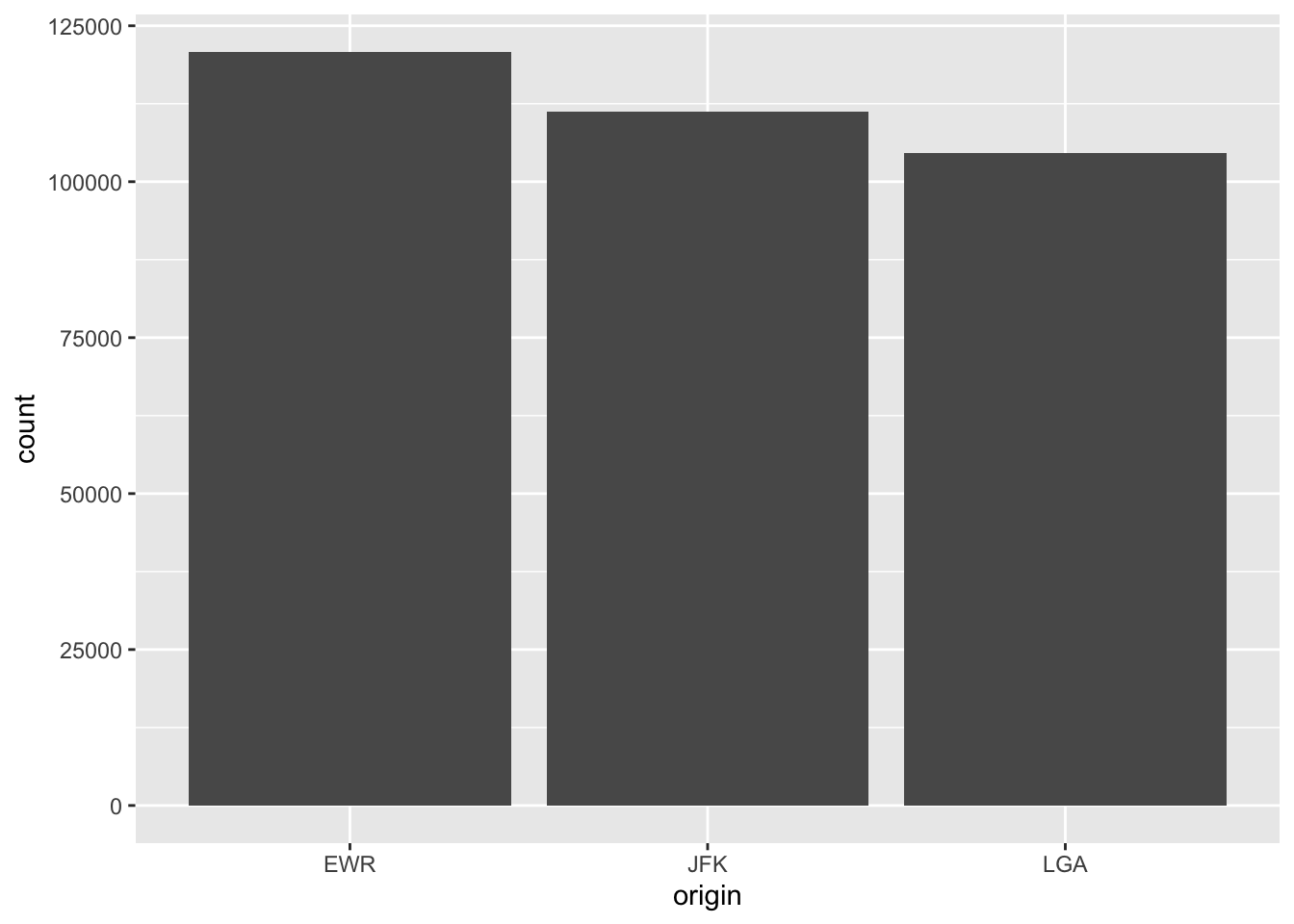
The default statistic for geom_bar() is count. Use the help function (type ?geom_bar in the console) to see other argument defaults and to see which aesthetics are applicable.
EXERCISE
Work through script ggplot_barplot.R and experiment with different
values for the arguments.
Histograms
Histograms are used to visualize a numerical variable.
Important choice to make: number of bins, default in R is 30.
df <- flights

histogram_distance <- flights %>%
  ggplot(aes(x = distance)) +
  geom_histogram()

histogram_distance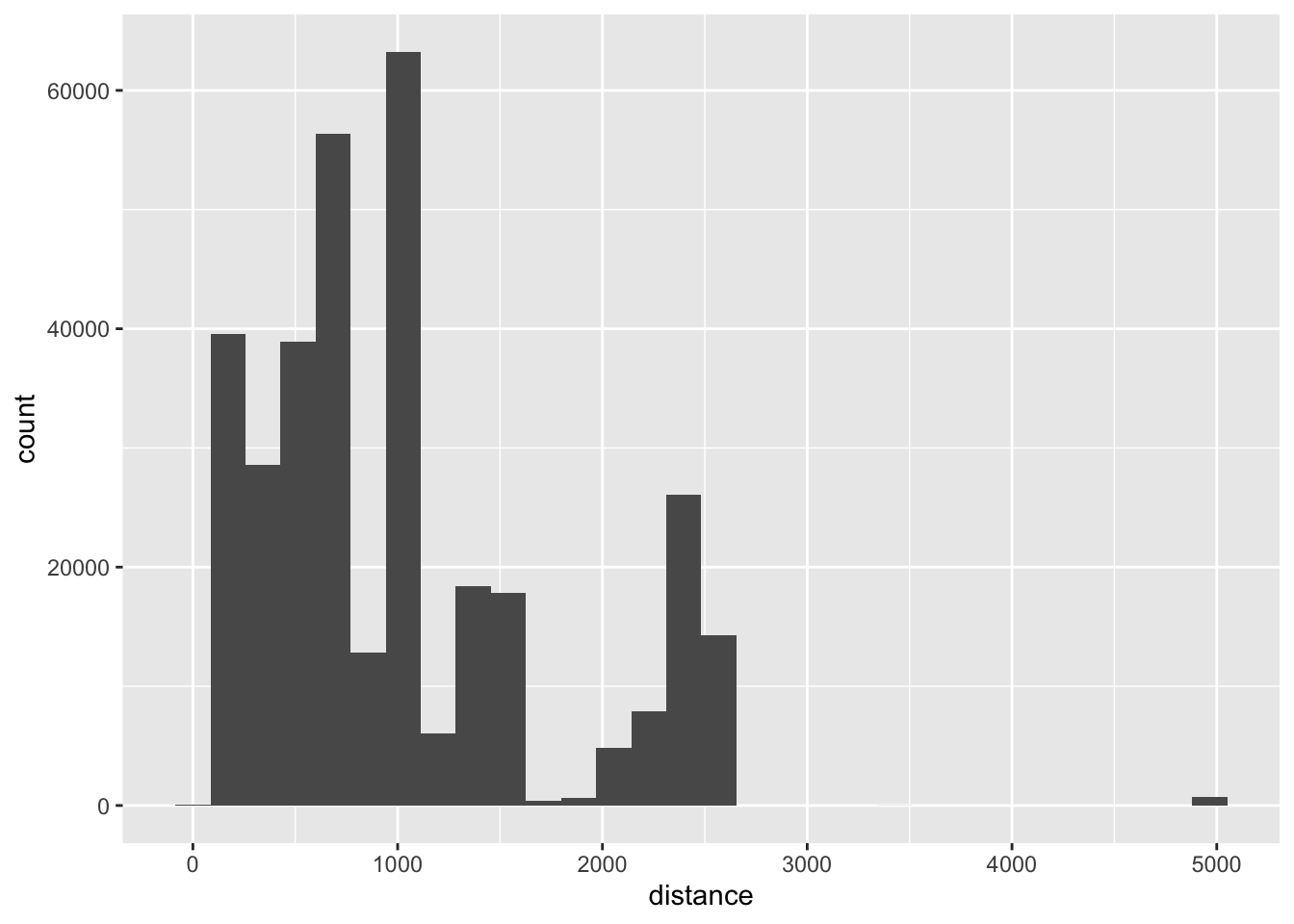
EXERCISE
Script ggplot_histogram.R
Boxplots
Boxplots are used to visualize numerical variables, especially with a
large number of observations.
For an explanation of boxplots see this website.
Boxplots are based on the so called five-number-summary: (1) Minimum,
(2) First Quartile, (3) Median or Second Quartile, (4) Third Quartile
and (5) Maximum.
df <- flights

boxplot_distance_01 <- flights %>%
  ggplot(aes(x = distance)) +
  geom_boxplot()

boxplot_distance_01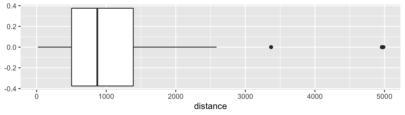
Boxplots are especially a good instrument to compare groups based on a categorical variable in the dataset.
boxplot_distance_02 <- flights %>%
  ggplot(aes(x = distance, y = origin)) +
  geom_boxplot()

boxplot_distance_02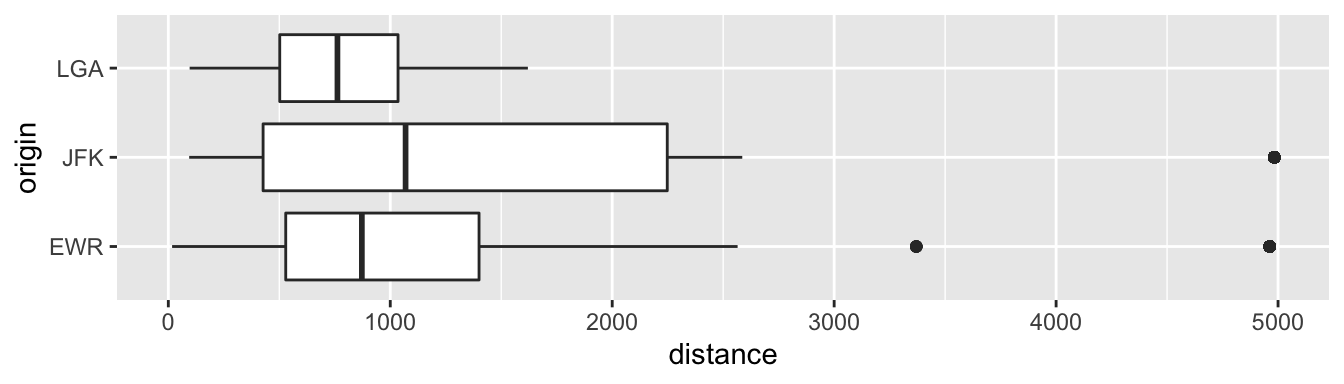
EXERCISE
Script ggplot_boxplot.R.
Stacked and Side-by-Side Barplots
If two categorical variables are involved in an association analysis,
Stacked and Side-by-Side barplots can be helpful tools.
Map one variable on the x aesthetic and the other on the fill
aesthetic.
The examples below are based on the same data; the stacked and the
side-by-side barplot examine the data from a different perspective.
stacked_barplot <- flights %>%
  ggplot(aes(x = carrier, fill = origin)) +
  geom_bar(position = "stack")            # position = "stack" is the default

stacked_barplot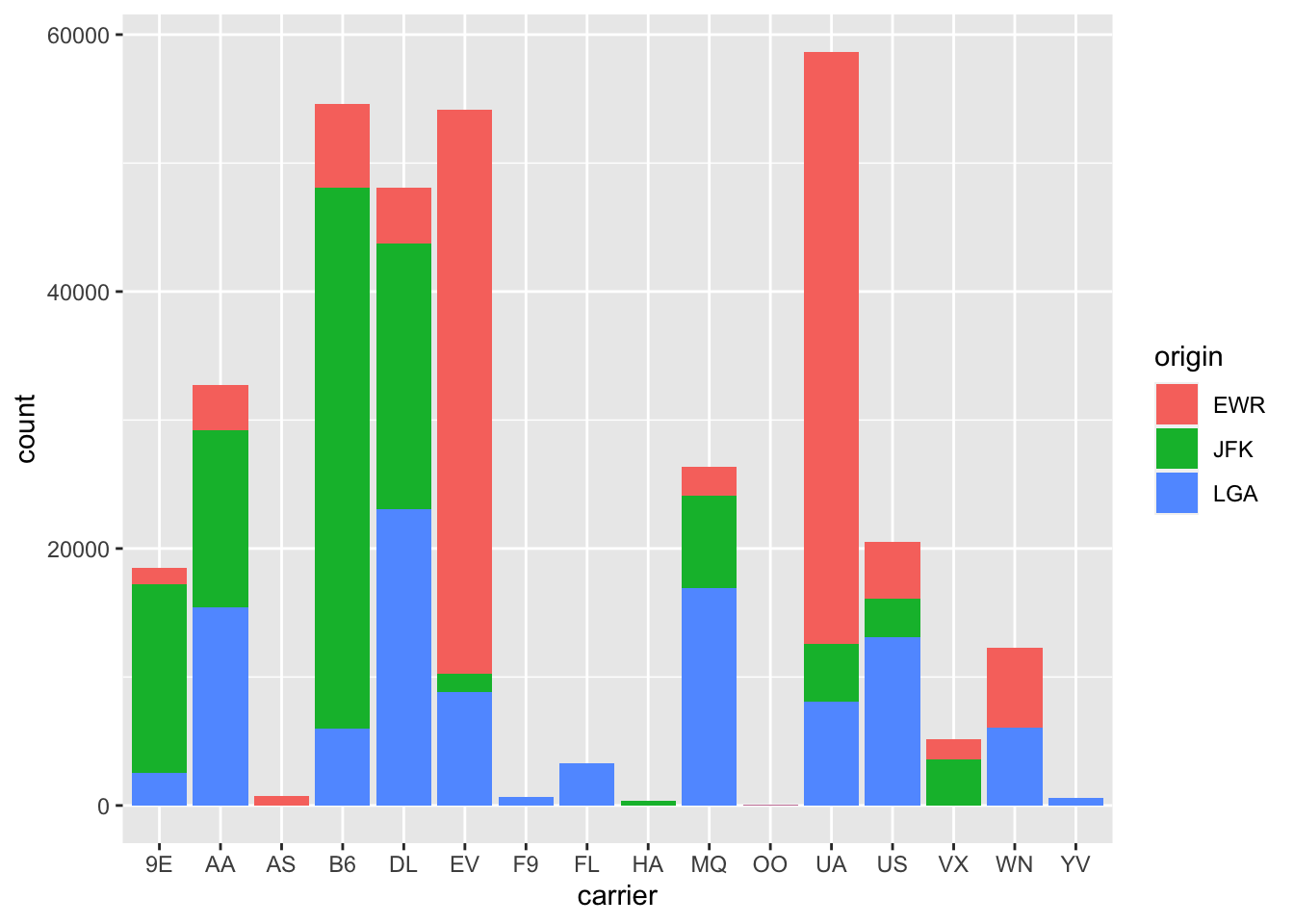
Side-by-Side Barplots
side_by_side_barplot <- flights %>%
  ggplot(aes(x = carrier, fill = origin)) +
  geom_bar(position = "dodge")

side_by_side_barplot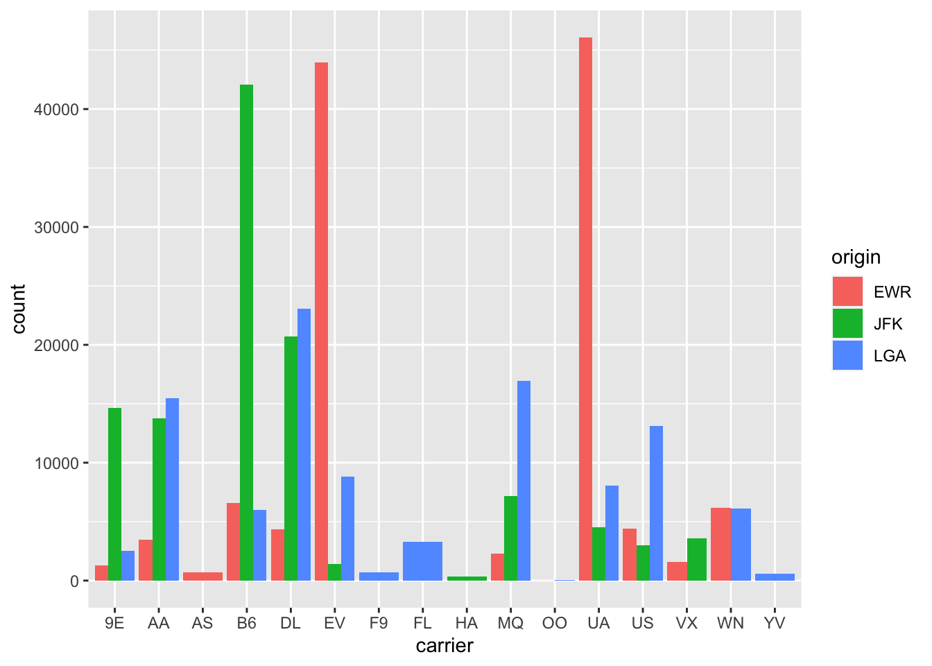
For those who want other colors for the bars.
side_by_side_barplot +
  scale_fill_manual(values = c("red", "black", "blue"))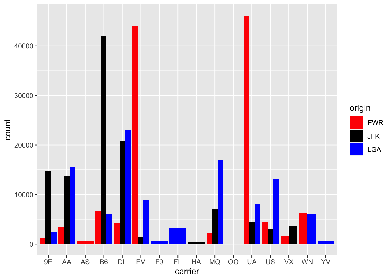
Scatterplots
Scatterplots (in ggplot use geom_point() for a scatterplot) are the first choice to examine the relationship between two numerical variables.
scatter_delays <- flights %>%
  ggplot(aes(x= dep_delay, y = arr_delay)) +
  geom_point()

scatter_delays
## Warning: Removed 9430 rows containing missing values
## (`geom_point()`).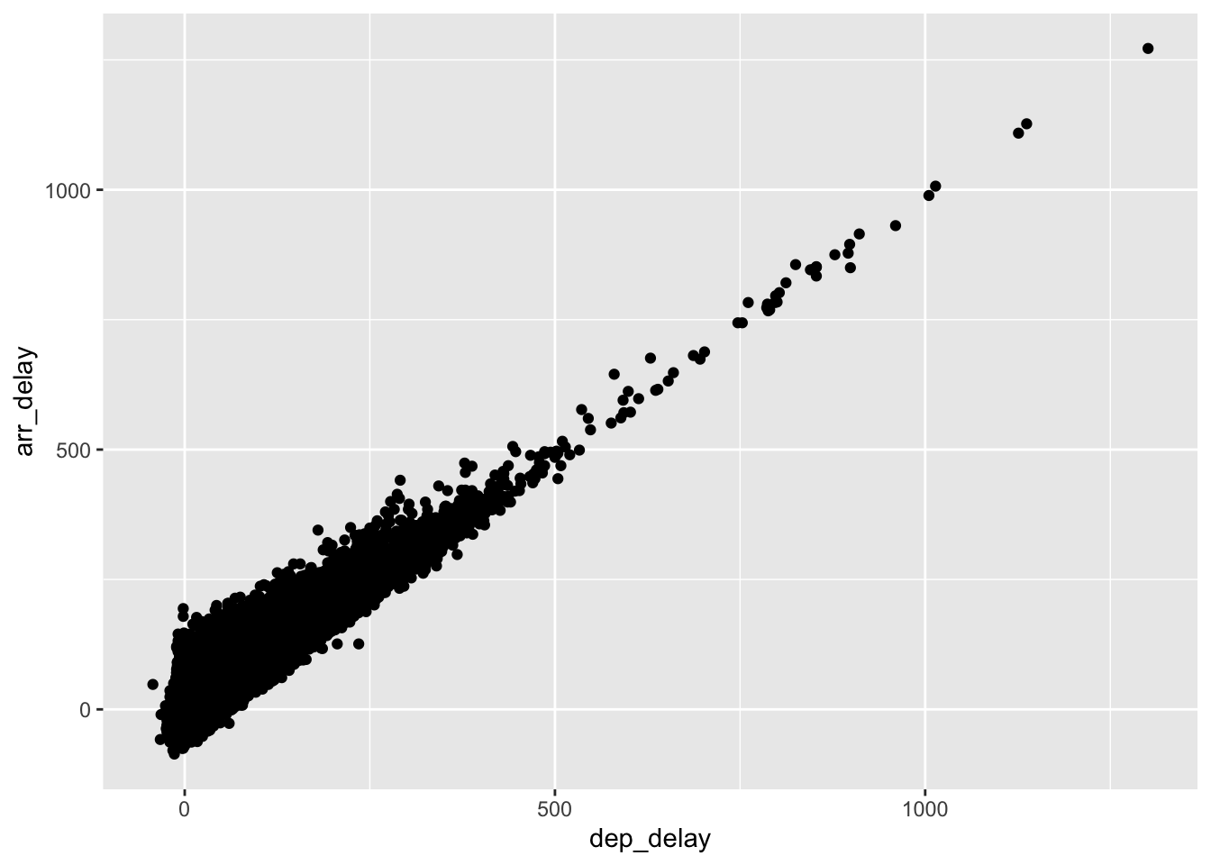
It is clear that the two variables are related.
EXERCISE
Script ggplot_scatterplot.R.
Time series: line graphs
For time series visualizing with a line graph is a good (first) choice. As an example: daily climate data in Amman, period 1973-2022.
amman_weather <- read_csv("datafiles/amman_weather.csv")## Rows: 18150 Columns: 29
## ── Column specification ───────────────────────────────
## Delimiter: ","
## dbl (25): TEMP, TEMPMIN, TEMPMAX, HUMIDITY, DATETIMEEPOCH, FEELSLIKEMAX, FE...
## lgl (1): PRECIPTYPE
## date (1): DATETIME
## time (2): SUNRISE, SUNSET
##
## ℹ Use `spec()` to retrieve the full column specification for this data.
## ℹ Specify the column types or set `show_col_types = FALSE` to quiet this message.head(amman_weather)plot_amman_temp <- amman_weather %>%
ggplot(aes(x=DATETIME, y = TEMP)) +
geom_line()
plot_amman_temp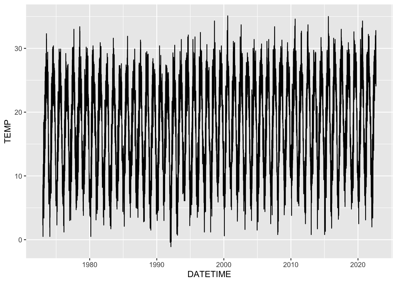
This graph is based on almost 50 years of data, in other words on
almost 50 times 365 data points.
Another option is to make a line graph in which the average monthly (or
weekly) temperatures are plotted. The principles of the coding below
will be discussed next class.
plot_amman_month_avg_temp <- amman_weather %>%
  mutate(YEAR = year(DATETIME),
         MONTH = month(DATETIME, label=TRUE)) %>%
  group_by(MONTH) %>%
  summarize(AVG_TEMP = mean(TEMP)) %>%
  ggplot(aes(x = MONTH, y = AVG_TEMP, group=1)) +
  geom_line()

plot_amman_month_avg_temp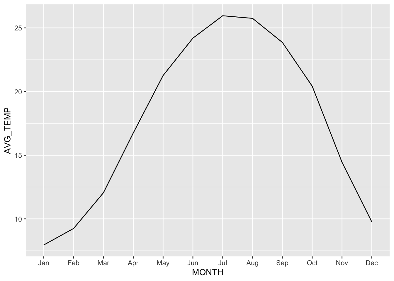
EXERCISE
Script ggplot_timeseries_tbc.R.
Visualizing Time Series
There are many ways to examine the TEMP variable using graphs. Some examples.
Boxplot Monthly Temperatures
boxplot_month_temp_amman <- amman_weather %>%
  mutate(MONTH = month(DATETIME, label = TRUE)) %>%
  ggplot(aes(x=MONTH, y=TEMP)) +
  geom_boxplot()

boxplot_month_temp_amman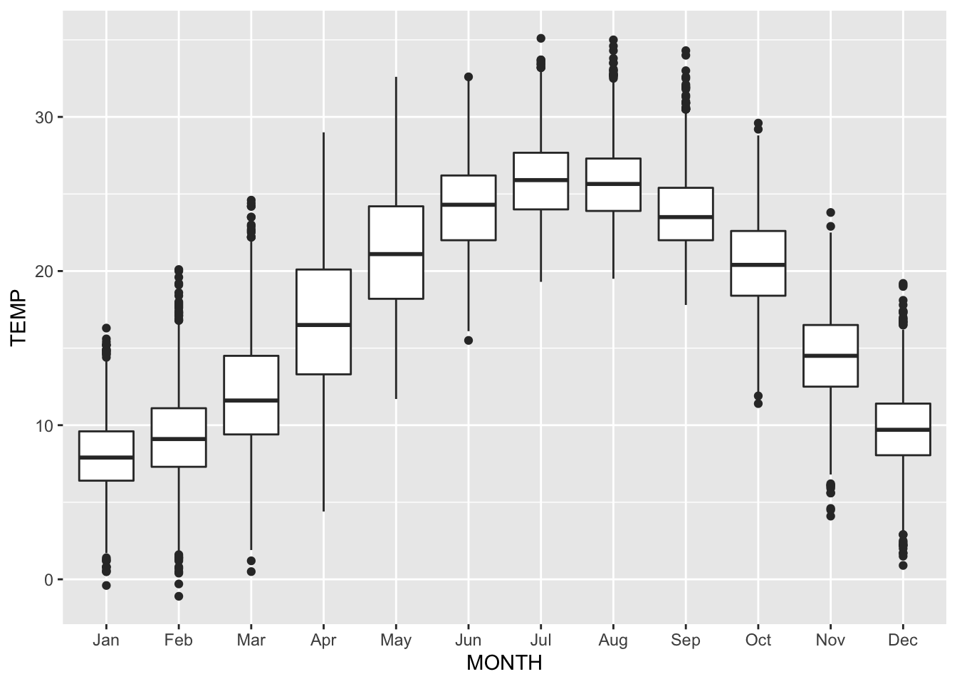
These boxplots are made based on 50 years of data, so the number of data points per boxplot is around 50 times number of days in the specific month.
Histogram of the measured temperatures.
histogram_temp_amman <- amman_weather %>%
  mutate(MONTH = month(DATETIME, label = TRUE, abbr = TRUE)) %>%
  ggplot(aes(x=TEMP)) +
  geom_histogram(fill='royalblue', col='gray') +
  labs(x = "Degrees Celcius", y = "COUNT")

histogram_temp_amman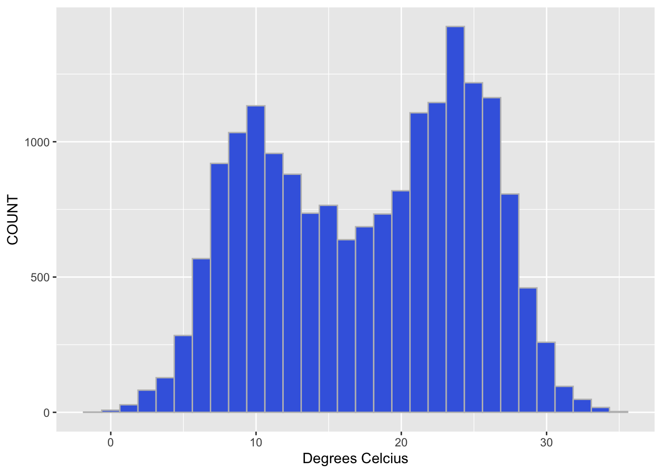
Side-by-side histogram with temperatures, broken down by month.
histogram_month_temp_amman <- amman_weather %>%
  mutate(MONTH = month(DATETIME, label = TRUE, abbr = TRUE)) %>%
  ggplot(aes(x=TEMP)) +
  geom_histogram(fill='royalblue', col='gray') +
  facet_grid(MONTH~.)

histogram_month_temp_amman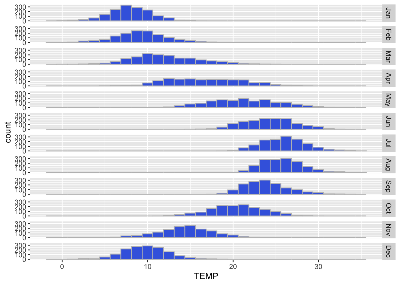
EXERCISE
Use your own dataset and create some graphs to explore the data.